Sponsored MasterClass

repOriginal
MasterClass sponsored ad on Facebook with Annie Leibovitz

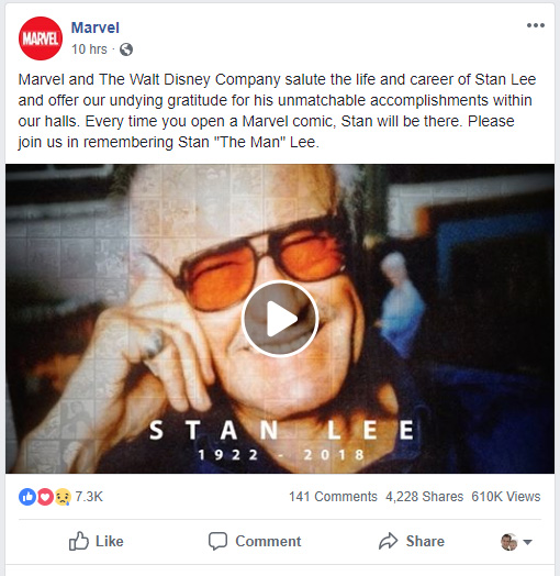
As I was scrolling through Facebook, this ad caught my eye. MasterClass has professionals teach lessons on their expertise. It is subscription based and you have access to all the lessons from any of the instructors.

They present themselves as professional and they get well known names teaching the different subjects. They present themselves as providing masters as teachers and thus you expect to get more value than you would with other teachers.

Those that follow a creative field will recognize the names in there field, and even those who don’t follow a field will still recognize many of the names. MasterClass understands their audience will get excited to learn from individuals who are famous now.

With this sponsored ad, I liked the image they used with Annie Leibovitz. It uses many different principles to create interest while maintaining balance.

repGoldenMovement
Golden Ratio movement

First I was curious with the camera if the golden ratio was used in the composition. It didn’t match the golden ratio exactly, but what it helped me see is the spiral movement within the image. The bright light in the upper right draws you in and then you circle to her eyes. You then continue around to the font. My eye then finishes near the center with the camera. This created a fluid, spiral movement for my eye.

repContrastingColor
The contrasting color of the yellow and blue

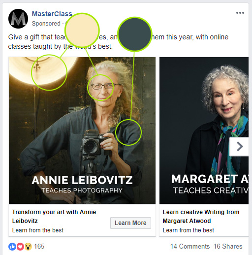
I also noticed how the shot uses the contrasting colors. We have the bright and warm yellows of the light and the skin tone. This is in contrast to the dark and cool blue in her shirt. These colors create contrast, but still balance each other.

repNotHalf
She and the camera are to the right

Another observation is Annie and her camera are not in the center of the frame. They are offset to the right. This creates more interest than if she was centered.

repBalance
Using the light to balance the layout

With Annie and the camera to the right, the image could easily feel unbalanced with the main subjects on the right. This is balanced with the use of the light in the upper left corner. The large and bright light create a high contrast against the background and add the balancing weight needed for the image.

All of this is done while focusing on the message of the ad. The image of Annie Leibovitz with her camera followed with the text emphasis what you will be getting. This with the well composed shot gives the sense of mastership.

Remembering Stan Lee

StanLeeVideo
Marvel’s Video Tribute to Stan Lee

Stan Lee passed away this week at the age of 95. He created many of the characters in the Marvel Universe. In memory there is a video talking about his life and influence. With him just passing away it uses the Zeitgeist principle, understanding the timing and this is what readers will be looking for. It tells some of story, the story of how he has influenced others, and thus provides value through the stories and meets our expectation of what Marvel would post about Stan Lee.

I am breaking down the final few frames and the one used before the video starts.

To begin I like how they used the comics  and then fade into an image of Stan Lee with his name and dates. His comic characters are a large part of what he is known for.

customGrid
The comics make a custom grid

The comics create a grid for the image. I especially noticed how the main typography rests on the grid. The grid also does well in framing the sides of his face. The comics also don’t completely vanish to highlight his Legacy.

typography
The typography

The typography also plays a big roll. The use a large sans-serif font in all caps to portray the most important information, his name. Then below they have his birth and death year in the same font, but smaller size. The dates are still readable and are important content to have. They also add the kerning between the letters to help with the readability of the font.

blackandwhite
Black and White
color
To Color

They also use black and white and color through out the video. They show black and white videos and images of Stan when he was younger. It gives them an age and helps portray his life before the color videos to today.

They also show colored images to show who he was near the end of his life as well.

This is also reflected in the final shot as it starts in black and white and then fades into color. It helps capture both the black and white from when he was younger to the color at the end of his life

I like how in this final shot, they have been able to combine the different aspects. There are a lot pieces which help display who he was and I think Marvel did a good job putting them together to help honor and represent Stan Lee without having it being overwhelming.

Haunted Homes

haunted
Facebook News Post about Haunted Houses

It is Halloween time and time for some Halloween news. The article Report: 1 in 4 Americans believe they live in a haunted house on Deseret News’s Facebook page caught my eye as I was looking at posts. Deseret News focuses on Utah adults, and this article also focuses on home owners and those looking to own a home. The image is of a home in Salt Lake decorated for Halloween.

The post itself acknowledges Halloween and provides the title and image to the news article. The news article then states facts and numbers from research done.

The article is short, using bullet points to quickly provide the information using least resistance. The post and article also use zeitgeist by connecting the article to Halloween. The information with numbers also provides value to the audience.

hauntedarticle

One of the main negatives is the use of dinosaurs. The dinosaurs are not what most would expect when thinking of haunted homes.

The image does succeed in other ways though. The main thing I noticed was how it uses composition and other principles to achieve the composition.

composition
Three focal points of the composition have the most contrast

When looking at the composition, the image has the three main focal points. These are the lightest and in turn have the most contrast and definition against the night. This can be seen with the pterodactyl on the left, the raptors on the roof and the glowing red light.

thirds
The points of interest are along the rule of thirds

The image also places these points along the rule of thirds. The pterodactyl is along the left third line, the raptors are along the top, and the red light is along the bottom and right line.

lines
The image uses lines to direct the eye within the images

The image also uses lines to help lead the eye from point to point. The dinosaurs eyes face to the right creating implied lines. The roof top also creates a line to help guide the eyes right. As you move to the right the tree creates a vertical line to stop the eye. A dinosaur’s tale then points back to the left and the roof to lead the eye back to the other dinosaurs.

All of this helps control the composition and to keep your eyes within the frame. It also has the dark, eerie feeling to match the articles title of haunted homes. Now if it just had ghosts instead of dinosaurs.

Brand: Target

banner

Target is a well known store. There logo is simple and most people will recognize it. What I noticed the most while looking at their brand is the high energy and happy feeling with their media. Even though they are large, they are presented as not being afraid to have fun.

With this feeling they show quite few children and younger individuals. They still show others, but the main audience are families with children. It portrays a more relaxed atmosphere where you can get what you need for your family and you don’t have to worry about bring your kids with you.

As we look at the cover image you can see the young girl full of energy. As I scrolled through I saw videos of dancing individuals and images kids smiling. They also connect to current events with a supportive post about the recent hurricane, Michael.

With many of the images of people, the images tell a story. This again can be seen in the cover image of the girl dancing and singing.

They use use repetition, color, and contrast to help with the feel of their brand.

repetition

The cover is the most obvious example of repetition. The red dots are repeated from the logo. This pattern going across gives an instant connection to the Target brand. It also breaks things up, but doesn’t pull the attention too much from the subject. I remember receiving Target ads in the mail earlier this year, and I found the repeated dots clever.

boldColor

For the color, I like the examples on their YouTube page. Each frame of the video or image uses one saturated color. We can see the bright yellow in one video, the red in another, and the green and blue in still others. The colors are bright and saturated to go along with the happy and fun feel of the brand.

contrast

Going back to the cover image, we can see how high contrast is used. With the saturated red against the white we have high contrast in the pattern. This high contrast helps keep the energy. With just the two colors as well, the subject contrasts against the sea of red and white. Your eyes are drawn directly to the girl.

Together all of these aspect help define Target as a brand and focus on their audience.

Heads or Tales

As a child I remember reading “Choose Your Own Adventure” books. I would curl up on the couch with one of the books in my hand and I would enter a new world. I would explore different times and places in the books.

I tried to solve the puzzle of which path was the most optimal. A finger would mark the choosing point as I turned the pages, ready to return if I died. Many times multiple fingers marked multiple paths and I debated if I could mark one more page. This would continue until I found the path though the book which brought a sense of accomplishment to me.

Then I would pick up the next book.

Years later, I was introduced to programming and programming websites. I was designing doors as a summer job when I overheard the boss talk about redoing the website.

I quickly glanced at the current website. It was very simple and I knew I could design a better website. I talked to the boss and said, “I would like to redesign the website.” He let me.

I worked the rest of the summer redesigning the site and learning new skills as I went. I enjoyed the job and the company was happy about the website. I even returned the following summer to continue working on the site.

Time has passed and I still enjoy designing and programming websites, and just last month I introduced my son to “You Choose Books.”

logo
Heads or Tales Logo

All of this leads to Heads or Tales. As I have looked at the possibilities of the web, I have had a desire to create my own choose your tale on the web. With links, the back button, and the interactive nature of the web, the pieces just fit and with the web, the story isn’t just mine. It can be yours as well.

I want to engage with others who remember curling up with a choose your tale book. We will look back at the stories we have read. We will look at other interactive tales. We won’t just choose a path to follow, but we will choose the paths to create.

We will communicate together with polls, images, and written posts. The story will be created with HTML, CSS, and JavaScript to easily be shared.

Facebook provides a platform where polls can be conducted, images can be shared, and discussions can continued through posts. It also is a familiar platform for many individuals who grew up with choose your tale stories. GitHub will be the platform used to share the story being created. It allows other to collaborate and watch the story take shape.

Now it is your opportunity to choose. You can casually watch the story unfold, talk about the stories you loved as a kid, or choose the paths to be created.

So what will it be, Heads or Tales?

Doctor Who Fan Creation

socialMediaPost
Original Post

The post on the official Doctor Who Facebook page is about engaging the fans of Doctor Who. It allows them to share their excitement with others and get others excited for Doctor Who before the next season starts.

The post starts by appreciating what fans have created. It then gives some quick instructions with an invitation to post your creation. It also uses a large image of the new Doctor with the hashtag to catch the eye of fans.

The post is focused on the fans of the show. They are the ones who will be sharing their own Doctor Who creations. As it is all about the fans, it connects with them by allowing them to share their love of the show. It shifts the attention to the audience and allows them to share their stories. It recognizes them and makes them feel appreciated, like they are part of something larger than themselves.

dalek
One of the creations posted by a fan.
story
Another creation posted with their story.

The post is successful based on the replies to the post with creations. The more replies with creations helps to strengthen the community. Also as the replies themselves receive positive feedback and likes the fans feel more appreciation and more engagement.

The Doctor Who post can be found at https://www.facebook.com/DoctorWho/


Choose to Stay Campaign

I would first like to look at a social campaign by The Church of Jesus Christ of Latter-Day Saints a day before Choose to Stay was published by The Church of Jesus Christ of Latter-Day Saints.

In preparation for General Conference the church released a short 46 second video about preparing for conference. The topic is relevant to a larger audience, the video takes less time to watch, and it was released earlier, yet based on the numbers Choose to Stay has been more successful.

generalConference
General Conference on Facebook


The General Conference video post had 56 comments, 1.7 shares, and 87k views on Facebook. Choose to Stay has 87 comments, 5k shares, and 230k views. I am looking at why Choose to Stay, a campaign about suicide, appears to be more successful.

chooseToStay
Choose to Stay on Facebook


The Choose to Stay campaign is about reaching out to those considering suicide and providing hope and support for them. The video is the main content, but it also includes a link for more information and a hotline for those considering suicide.

The campaign presents a topic which can be hard to talk about. It gives a venue for individuals to open up about the topic. The topic is more specific and personal. This gives it more value than a more general message would have. The 4-minute video is also short enough and worth the time to invested to watch.

Choose to Stay also helps give attention to those who need it. It addresses and recognizes those with suicidal thoughts and lets them know others have felt the same. The speaker even directly faces the camera and directly speaks to the audience and thus noticing the viewer directly.

lookAtCamera
The speaker directly speaking to the audience.

The most engaging and important principle which makes the campaign successful is the story. The speaker starts with a story. He continues to tell stories as he grew. He tells a personal story and we feel some of what he felt. We empathize with him. The story drives the campaign.

Choose to Stay is able to engage and connect with the viewer and thus making it a successful social campaign.

Both social campaigns can be found at https://www.facebook.com/LDS/

L13 – Remember, Tools are Just Tools

I was reminded tools are just tools as I became frustrated with a tool we used this week. It was with WooRank, which we used for our final project and it’s inaccuracy caused me extra stress.

My score started out alright, and things looked fairly good. I chose what I was going to correct. I then made all the corrections. Some of them where fast, like a broken link due to a misspelling. Just correct the spelling and it was fixed in seconds.

Others took more time and research. This included eliminating render-blocking CSS in above-the-fold content. This was new to me, the correction took some research and messing around with before I got it right.

Then came the moment of truth. I ran WooRank again. To my surprise my score dropped a full 10 points. It did not recognize about half of my changes. In addition it marked multiple, additional problems which where fine before. These included items I had not changed from the first test, and I knew where not problems.

This caused some stress and disappointment in the tool. This is where I learned the lesson to remember tools are just tools. They are there to help. They can help us understand ways to improve, or help us do things more easily or quickly. The danger comes in relying too much on any one tool. It can cause extra stress when the tool doesn’t work. We also can miss out on other important aspects when we focus only on one thing.

Eventually, I did tried WooRank one more time on a different computer. Things looked much better. My score went up about 8 points from the original score instead of down. All the changes I made where recognized and the inaccurate problems didn’t show up. The most important thing I learned though was to remember tools are just tools.

L12 – It Isn’t About Me

One thought I had this week was, it isn’t about me. It is easy to get caught up in what we want to do and focus on making money. We can chase the superficial, but happiness comes when we go beyond ourselves and think of others.

Part of this thought processes has come while thinking about social media. In social media it is an interaction. We can see what people are interested in. We can use it just to push our ideas, but the strength comes in the social aspect. It is where we discuss and learn from each other. We gain a better understanding of what others are truly interested in.

This process isn’t always easy though. Everyone has a different view and different experiences. When communicating, we should listen more than we speak, and this can be hard to do. When listening, it is also about trying to understand the other and not just tossing their thoughts aside.

Another time the thought ‘it isn’t about me’ came while taking my son the his first movie in a theatre this week. It was a new experience for him, and he was very excited. It was an enjoyable experience, and it wasn’t about me. It wasn’t about going to the movie I wanted to see, but it was going to a movie he would enjoy. It was about going to the movies with my son for the first time.

In life we can focus on me, but I have learned the greatest joy is when it isn’t about us. When we step back and focus on others, that is where we find the true joy.

L11 – Adding Value

This week, one of the focuses for me was creating value for visitor. It is important to provide information and tools visitors are looking for when they visit your website. This includes adding value to existing items, adding quick updates of value, and working on projects which take longer and add value.

My site has visitors using a link to an online calculator. It was nice to have this link, but I wanted to add more value. To improve value I include links to help documents. This makes it easier for visitors to find help at one location. This was a small and quick change, but added some unique value.

The second dealt with calculators as well. With the online calculator drawing traffic, I worked with my wife to create new content in the way of a review for purchasing graphing calculators. This included my wife’s personal experiences and helps others make an informed decision.

The last is creating a game for systems of equations. This will add a learning experience which should include some fun as well. This should help to engage individuals who want to learn system of equations. It will take time to create and is more of a long term project, but the can provide value.

There are different ways to add value to a site. It is good to look at what value current content provides and how to improve it. We should also look at adding value which can be done quickly and others which will take more time. The main thing to remember is to add content which provides value.